Redesigned Website: Theory and Thoughts
For the past few days I have been contemplating to upgrade the design of this website. Not that the previous UI had any apparent flaw – it was quite simple and neat. However, I wanted to move a little higher from the then minimalist approach, and wished to add a little splash of color. Besides, a little change from time to time is nice. Motivated by this, I rolled out the latest version of the website two days back!
Inspiration
For the sake of fairness, let me acknowledge at first the source of inspiration behind the current design. I have been looking at the new design of the website for Django, which is a job nice done by Andrew McCarthy, for quite some time now. What kept me gazing at that website is a simple, beautiful, and clean UI with pleasant, contrasting colors. And, of cource, the wonderful CSS icons and animations! The present design of the home page of my website is partly based on the style used by Andrew.
Let me repeat again, one of the aspects that kept my eyes glued to the Django project’s website is its color scheme. Let me mention it upfront that I am not quite a designer. I usually create website based on some adequately adapted existing designs. The ones that I design from scratch tend to be rather simple. So, this time I thought to give a reading to color theory a bit.
Theory
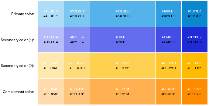
Color theory is an essential component of design, but perhaps you already know that. Again, since I am no expert in this field, I would not lecture on this, and refer to you to the link at the beginning of this paragraph for an example. Essentially, there are different techniques for choosing a color scheme, for example, monochromatic, triad, and tetrad. The website of Django uses a monochromatic color scheme with different variations of green. However, I wanted to use a complementary color as well. I eneded up with Paletton to choose some appropriate colors.
Paletton allows to select colors using five different schemes. I used the "triad" scheme. Now, I have some bias in favor of the bluish navigation bar at the top, and I wanted to retain that color. So, I moved one of the markers in the color wheel towards blue. Turns out that yellowish-orange range complements bluish looks. The following picture shows the color scheme generated by Paletton.
Practice
The colors so generated were well and good. However, I did not feel like the orange shade having decent contrast with the dark blue shades. Therefore, I settled down on a darker shade of orange with the HTML color code tomato. Seemed nice to my eyes at least.
A few other changes also followed. Now every page has a subheader with a light blue background. Moreover, since Bootstrap 4 is going to drop support for glyphicons, I replaced the existing ones with Font Awesome. The erstwhile contact.html page has been dropped; social media links are now presented in the footer. And yes, the animated pentacle logo has been discontinued – in this present version at least.
Thoughts
Of course, every work ends with several scopes for the future. In particular, I intend to add up a little more CSS animations. I leaned about CSS-based circles while working on this revision, but, no doubt, I need to learn more about them. Any more insights from color theory would be of help. Finally, to switch to material design or not is the question. But regradless of all these things, continuous experiments with your own website is a source of much joy in itself!